In the first part of this two-part blog series on how to build and design a custom Projects Dashboard application, we brought Office 365 data which will allow us to filter Projects by Project Manager metadata. In part two, we will be connecting our application to a SharePoint list which contains the Project Details.
Adding our Projects SharePoint list to the app
These are the steps we need to take to add a SharePoint list to the app:
- Add gallery
- Connect gallery to the data source (Projects SharePoint list)
- Enable search
- Filter by selected Project Manager
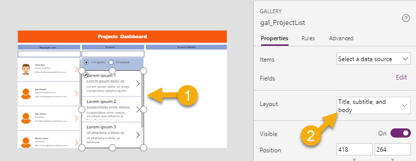
The first step is to add another gallery to the app, rename this gallery to gal_ProjectList and connect to SharePoint (Projects List).
Now we need to change the layout of the gallery from Blank to Title, Subtitle and Body. To do that, select gal_ProjectList gallery and make the change from the layout dropdown on the gallery property pane.
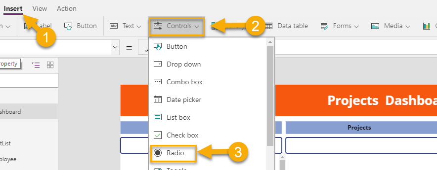
Before connecting gal_ProjectList gallery to the SharePoint list, we will need to add two additional controls; one for a text input box to search projects (rename text input box control to SearchProject), and the other for radio control to filter between In Progress and Completed projects. When doing this, ensure your SharePoint list has a column that tracks your project’s status with two available options (In Progress and Completed). Since we’ve already added a text input box before, let’s focus on radio control with two options to filter the list. Insert > Controls > Radio. After radio control is on a canvas, rename the control to Rd_ProjectStatus.
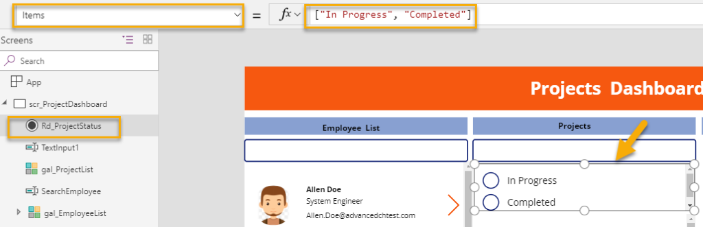
Place Rd_ProjectStatus radio control under the text input box on the canvas. Next, we will have to define the choice options of the Rd_ProjectStatus radio control. By default, control has 1 and 2 as choice options. Select the control and paste these options to the Items property of the control, these are In Progress or Completed.
Note: Choice options must match drop-down column value in your SharePoint List.
To make the appearance sleeker, I am going to switch theLayout from Vertical to Horizontal, change the default value to In Progress and set the background color to light blue.
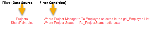
Now, we are ready to connect the gallery to the Projects list. Select a gal_ProjectList gallery and paste the formula below into the Items property of the gallery.
Search ((Filter(Projects,'Project Manager'.DisplayName = gal_EmployeeList.Selected.DisplayName && 'Project Status'.Value= Rd_ProjectStatus.Selected.Value)),SearchProject.Text,"Title")
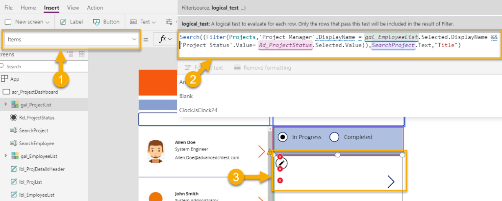
Note: for the above formula to work, make sure that all control’s names used in the formula match what we have in the app.
Let’s breakdown the formula to parts that are easier to understand. The formula contains two functions: Search and Filter. I passed the Filter function as a parameter in the Search function.
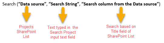
Data source: The data source is filtered. In my case, I would like to show only a project based on Project Manager selected from the gal_EmployeeList gallery and Rd_ProjectStatus radio button selected. That is why I filter the data source part of the Search function below:
Search string: SearchProject.Text
Search column: Title (SharePoint List column)
Don’t panic if you see a blank gallery with red Xs. The reason we receive these errors is because the labels in the gallery are not pointing to the right data source fields yet, this is easy enough to correct. Select the first red X and change the text property of that label to the project’s Title.
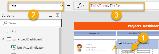
Repeat the above steps for the rest of the labels in the gallery pointing to the fields you would like to show. In my case, I have demonstrated Project’s name (Title), Client’s name and Project State.
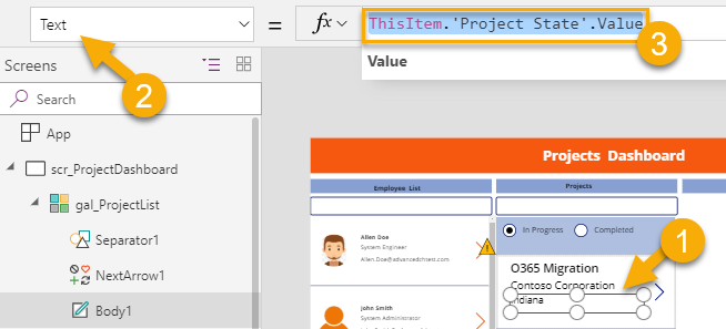
I want to point out that the Project State field is a dropdown SharePoint field and considered a complex field, which is why the approach is a little different. When you select the third red X and navigate to the Text field property of the label you should paste this formula.
ThisItem.’Project State’.Value
Note: You noticed that we are not only specifying the field name but also “.value” parameter. Since this is a complex SharePoint field, we need to reference the field name and include the value.
Note: During development, I experienced a bug where after entering a correct formula, I still had a blank gallery. To resolve this, I had to save my app and re-open, which fixed the problem.
The last section in our app is a project’s details pane. For that, we are going to insert a Display Form, connect the form to the Projects SharePoint list, select fields to display to show details of the selected Project in the gal_ProjectList gallery. A
Repeat the above steps to add any more fields you would like to appear on the project’s details pane. Next, I will demonstrate how to design a dynamic section header based on the Project Manager and Project selected.
The app has three sections and each section has a header.

Let’s make a display text in the Projects and Project’s Details sections dynamic.
Projects header: Project’s manager name selected in the gal_EmployeeList gallery
Project’s Details header: Project name selected
Select Projects label and paste the formula below to the text property of the label.
If(CountIf(Projects,'Project Manager'.DisplayName=gal_EmployeeList.Selected.DisplayName &&
'Project Status'.Value=Rd_ProjectStatus.Selected.Value)>0,gal_EmployeeList.Selected.DisplayName
&"'s  Projects", "No Projects Assigned to
"& gal_EmployeeList.Selected.DisplayName )
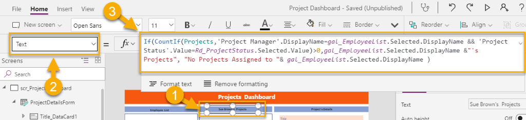
Formula explanation:
If the count of projects for the selected Project Manager is greater than 0, then show “Project’s manager name selected + ‘Projects’”
If the count of projects for the selected Project Manager is less than 0, then show “’No Projects Assigned to’+ Project’s manager name selected.”
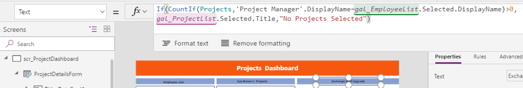
We will take a similar approach for Project Details section. Paste formula below, selecting “Projects Details” label.
If(CountIf(Projects,'Project Manager'.DisplayName=gal_EmployeeList.Selected.DisplayName)>0,gal_ProjectList.Selected.Title,"No
Projects Selected")
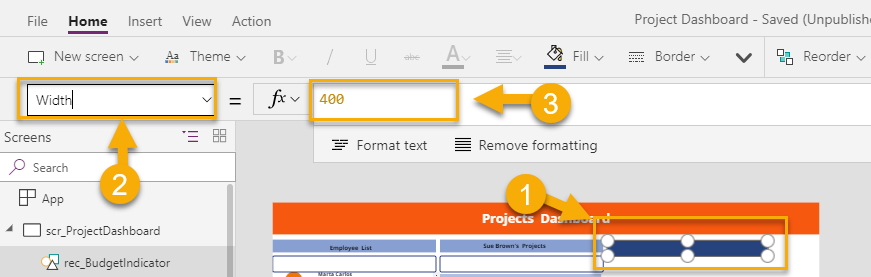
Lastly, let’s add custom charts to the app. I am going to design a bar chart based on the budgeted amount for the project versus the amount spent. Projects’ SharePoint list has columns named Project Budget (currency field) and Current Financials (currency field) to display financial details of the project. To design a bar chart, I am going to use simple rectangles, each of them will have a different color and width based on the value.
Insert a rectangle to the canvas and position it appropriately. In my case, I placed my first rectangle right above the project’s details. The first rectangle will represent Project Budget which is 100% of the amount. We will set the width of the rectangle to 400px.
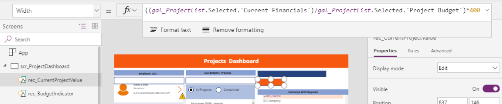
Now we need to place another rectangle, which will represent Current Financials amount, we will have to make the width of this rectangle proportionate to the Budgeted amount in ratio.
Insert a rectangle, change the color to contrast the other rectangle and paste this formula to the width property of the rectangle.
((gal_ProjectList.Selected.’Current Financials’)/gal_ProjectList.Selected.’Project Budget’)*400
Basically, I am dividing Current Financials value to Project Budget value and multiplying to 400 since I set the base width of the top rectangle (Project Budget) to 400px.
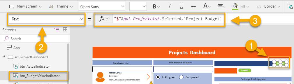
To make it clearer, I am going to place an object for each bar chart to represent the actual number value. I’m going to use button control because buttons have text and background properties that I can use.
Insert a button to the canvas, change the fill color and paste formula below to the text property of the button.
"$"&gal_ProjectList.Selected.'Project Budget'
This formula will show the budgeted value of the selected project.
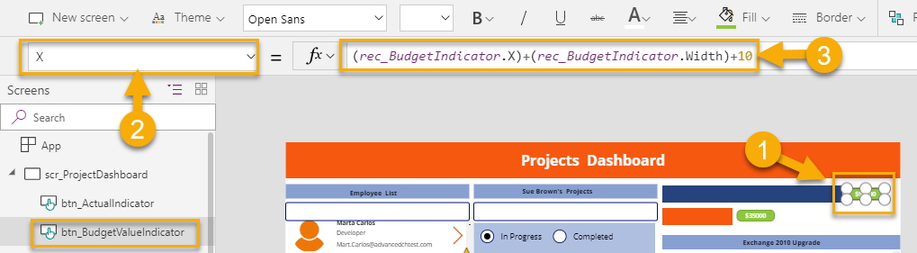
Also, to make the position of the button relevant to the width of the bar chart, paste formula below to the X property of the button. This formula makes the button move according to the rectangle’s width.
(rec_BudgetIndicator.X)+(rec_BudgetIndicator.Width)+10
Note: name your rectangles (bar charts) properly for the formula to work. In my example top rectangle named as rec_BudgetIndicator and the bottom names as rec_CurrentProjectValue.
Repeat the same steps for the second number value indicator. Insert another button and paste formulas below.
For text property of the button:
"$"&gal_ProjectList.Selected.'Current Financials'
For the X property of the button:
(rec_CurrentProjectValue.X)+(rec_CurrentProjectValue.Width)+10
We are done, our app is ready to be used. For simplicity, in this blog post, I didn’t go through the little details to clean up the app’s functionality but I gave you the core idea of how to build your Projects Details app. Now, you can run the app:
In my upcoming blog posts, I will be adding some complexity and workflow, so make sure you stay tuned!
You can download current version of Projects Dashboard V1 (PowerApps app and SharePoint list template) in this GitHub repository.
To conclude, I would like to point out that you don’t have to be a developer to build fully functional enterprise level applications using Microsoft’s Power Platform. Also, this doesn’t just enhance your existing business processes but also increases the usability of the Office 365 platform in your organization.


Hi! Great post.
Is it a possibility to add pending and/or tasks for each project? Thanks so much!
This was a very interesting and informative post! Thank you so much for sharing and impacting knowledge. Can I know when part 3 is coming out?
Hello, I want to say a very big thank you for this great and understanding tutorial. This is great.
Can also show as how to restrict some users from viewing a portion of the application and allowing only admins to see every part of the app ?
Thanks a million
Hi Stephen,I would recommend to hide object based on user logged in. I have written one article where I described similar scenario: https://www.practical365.com/sharepoint-online/automated-user-creation-flow-powerapps/
All the way at the end of the article you will find that description. Description in the article above is very simple. You can also achieve the same based on Azure AD security group or Office365 Group membership.
Thanks
Hi Daler,
Great Instructions !
But how do I stop the Actual Indicator button moving to the left of the Canvas when the cost is blank?
Regards,
Victoria
Hi Victoria,
You should try to set the “If” statement to make it work.
Is there any reason in cannot connect to office 365 for the employee list?
Maybe there are some restrictions that your Admin setup up .
Without seeing an error, it is hard to determine why.
Thank you
This is brilliant thank you!
Did you ever create the other blog post?
I could not find it.
I am thinking to extend this application. Hopefully in upcoming blog posts.
In the next few days, new article is going to be posted on how to run PowerShell script from Microsoft Flow.
Thanks
Great information. I was really hoping you would show how you created the counter circles though. Do you have another blog post on that somewhere?
Pie charts are available in PowerApps.
Gracias Daler!
Tu artículo fue muy claro de entender, y haciendo un poco de práctica e investigación nos permite agregarles otras funcionalidades. Gracias por compartir la información, y estaremos atentos a más de tus posts.
Is there any way to filter the staff list down? We have three hundred user but only 6 project managers. The employee list defaults to showing everyone in alphabetical order. I was able to filter on department to cut the list down but due to some odd limits with Graph it only shows two of my PMs. I am able to search for the others without issue but it looks odd to just see two in the list.
Hi Dave, thanks for the message. I agree that not everything works perfectly when you connect to Office365 connector in PowerApps. All the filtering options are based on Azure AD attributes. I had a similar case where the tenant had a couple of thousands of tenant users and only a dozen PMs. For performance reasons (in my case), I only wanted to manipulate those 12 PMs in my app. In this case, I would create a SharePoint list where I store records for my PMs (Name, email address, etc) or even use people picker field. Then connect this list to your PowerApps and use it as your data source for PMs
Thanks
Thanks Daler. I’ll give that a try. Great article, very well laid out.