New Teams Client Available for Windows and Mac
In March, Microsoft released the Teams 2.1 client in preview. Ever since, innumerable updates and refinements have appeared to bring the new client gradually close to feature parity with the Teams classic client. Remember, the classic client didn’t stay still during this period as Microsoft kept up the development pace on that front.
Today, Microsoft announced that the Teams 2.1 client is generally available for Windows and macOS (desktop and browser) and ready for widespread deployment. Some small feature gaps remain (for instance, you can’t set a custom duration for a status message), but these will be closed over the next few weeks. What’s for sure is that Teams 2.1 is now the sole and exclusive focus for future Teams development. The Electron-based classic client is now on the slippery slope to retirement. To be fair, it’s had a good run to take Teams to its current 300 million-plus monthly active user count.
Making the Pig Perform
Successful as the Teams classic client has been, it’s hardly been loved. Soon after launch in 2017, the client acquired a reputation as a performance pig, content to wallow in as much memory as a workstation could deliver. Especially after the pandemic drove a huge increase in Teams usage, notably in meetings, Microsoft dedicated huge engineering effort to put lipstick on the pig. As the then VP of Teams development, Rish Tandon, discussed in mid-2021, Microsoft explored every angle to trim memory and increase performance.
Any architecture has limits. The Teams 2.1 client uses a new architecture. Microsoft claims that the client uses 50% fewer resources (on Windows) and performs twice as fast as its classic counterpart. My experience of Teams 2.1 is that the client runs faster and is noticeably more responsive in many areas. The performance monitor shows that the client consumes about 550 MB, and that’s in a session where I switch between 3-4 tenants to chat, participate in channel conversations, and attend meetings. The classic client invariably consumed more memory and was more sluggish.
Important as it is, performance isn’t everything. A fast client with a horrible interface is still a pig (with no lipstick). You’ll hear a lot about the “more polished and responsive UX,” or shorthand for an overhauled but still familiar user interface. I think it’s fair to say that the new user interface helps convey the feeling of better performance in Teams 2.1.
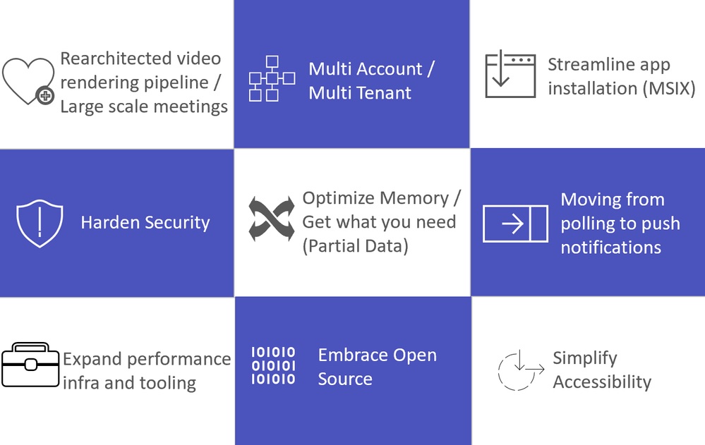
Figure 1 shows some of the other factors influencing the new Teams architecture. The rearchitected video rendering pipeline is important given that the new Town Hall feature is taking over from Teams Live Events (which uses a different platform) and will scale up to 20,000 attendees (with a Teams Premium license). Given the number of meetings people attend, any deficiencies in Teams meetings would attract huge attention. So far, I haven’t noticed any glitches.
A Better Multi-Tenant Experience
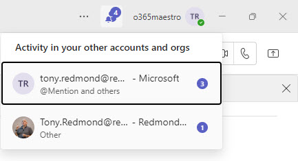
As someone who spends a lot of time switching between tenants, I am grateful for the reworked switching experience, which is fast and seamless. I also like the way that Teams delivers notifications from all tenants and not just the one that I’m logged into, and the way that I can respond to chat in a popped-out window that’s connected to a different tenant. The notifications section in the top window bar shows activity from accounts across all tenants (Figure 2) and makes it easy to switch to the tenant where most activity is occurring. It’s an example of a good fit and finish.
Teams 2.1 is the first client to take advantage of multi-tenant organizations (MTO). As I explain in this article, we’re only scratching the surface of what MTOs might enable for clients, but it’s good that Teams is the first mover in this space.
Deployment
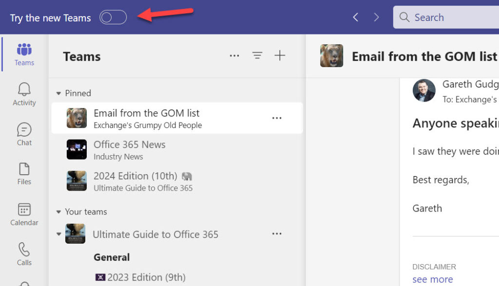
Now that Teams 2.1 is generally available, thoughts turn to deployment and how best (and when) to replace the classic client. Microsoft says that the upgrade is with a single-click. Technically, this is true, if the right conditions exist and a user switches the toggle to move to the new client (Figure 3).
In most cases, I think deployment will be more measured and controlled at the organization level rather than letting individual users decide. That means using:
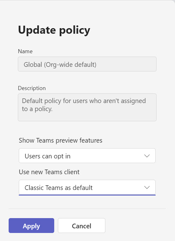
- Teams update policies to decide when users see the toggle to move to the new Teams or (eventually) are forced to move. For instance, you could decide to use a default update policy (Figure 4) to keep the organization on the classic client until Microsoft completes their work to achieve feature parity (probably in early November) and you’ve had a chance to decide what precise deployment tactics to follow.
- Tools like Intune to deploy the new client software to workstations.
- Office updates (Teams is included in the Microsoft 365 apps for enterprise).
- Individual user updates (Teams 2.1 is available for download from Microsoft’s website).
For more information about deployment tactics, read Microsoft’s documentation. It’s also a good idea to keep an eye on the known issues page.
A Good Update
Let’s be clear. Despite the interface refresh, better responsiveness, and reduced appetite for system resources, people will still complain about the Teams client. It’s too complicated, the client runs slowly on my PC, or I hate the new color scheme (if you do, go to Settings, Appearance and accessibility, and choose the Classic theme). It’s the nature of integrated clients that change often provokes odd reactions. Think of all the adverse comments passed about Outlook over the years.
Teams 2.1 is a good update. Those who spend their days working in Teams will appreciate the changes because they really do make a difference. I wish I could say the same for every software refresh, but I can’t.




My biggest problem with new teams is that there is no notification on the icon itself like in the classic teams. So, if I were to miss a call or a message – I do not see this on the teams icon in the taskbar marked with “1” like before , but i only see “new” label on teams icon. How could MS could go live without something as important as this is beyond me.
Anything of note regarding PSTN calling or any other telephony feature?
Nothing that comes to mind. But I think you’ll see progress in this area as the new client gathers pace – and watch out for announcements at Ignite next week. Who knows what Microsoft will come up with there.
Tony, thanks and will check out Ignite.
Microsoft is aware of the known Outlook Presence issue when using the New Teams client. Hopefully thats fixed sooner, rather than later.
Any idea how or when they will remove the old Electron client? Everything I’ve seen talks only about the new version, how it will roll out, and how you can switch back but nothing on when the switch will be permanent or how the old client will be removed.
It’s inevitable that the classic client will go away in due course. My feeling is that we won’t be able to use the classic Teams client this time next year. I’ve been known to be wrong.
Currently, normal message order in channels is repaired.
Long hate story is here: https://feedbackportal.microsoft.com/feedback/idea/fd7275b6-46ca-ed11-a81b-000d3a0450e3
New Client is fast, stable and usable.
Users can choose how they want to read channel messages in the old or new way. It’s up to them.