Microsoft has publicly announced that the Yammer-based Office 365 network is being moved to a new forum based on the Lithium community platform. The move is not being received very well by the Yammer community. I’ve never seen such an active Yammer thread, and the responses are overwhelmingly negative. Nonetheless, the move is going ahead and all Microsoft staff will focus exclusively on the new community starting from now. The Yammer network will be shut down on September 1st, allowing some time for members to retrieve any important content that they have bookmarked and want to preserve for their own use.
There’s a lot to say about this move by Microsoft. Tony Redmond has adequately covered the strategic elements of it in his post on IT Unity. A variety of other posts are surfacing on LinkedIn and various MVP blogs. There’s a lot of emotion flying about.
I’m personally not bothered by the move away from Yammer. The Yammer platform can work very well for enterprise collaboration, but as a semi-public community forum (anyone could register and participate, but the content wasn’t indexed by Google/Bing/etc) I always felt that the user experience was poor. The proliferation of groups inside of the Yammer network that were not easily discoverable, had also created a lot of friction and made seeking out conversations somewhat of a chore.
Unfortunately, in building the new Office 365 network, Microsoft has only managed to create a new UX problem to deal with. No doubt many hours of work went into planning and designing the new community, and it’s easy to stand outside and throw rocks, but there’s some very obvious problems with the new design that I think will hinder adoption.
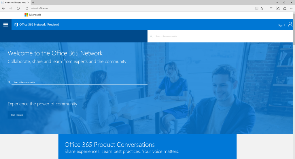
To start with, the homepage that you land on is a ghost town. This is bad for any community that is trying to entice members to join. On my large display the entire screen is filled with what amounts to nothing at all.
Scrolling down, we’re presented with a list of categories and recent conversations. I’ve zoomed my browser out to show all of it. There’s 8 categories visible, and five recent conversations.
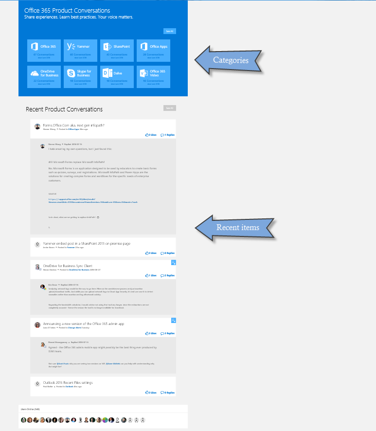
Leaving aside why an “Office 365” network needs a category named “Office 365”, there’s not a lot to see here. But there are “See All” buttons enticing me to see more. However, on clicking either of them, I get to see just two additional categories (why not just show me those to begin with?), and the exact same list of recent conversations.

By the way, that “Product articles and stories” part at the bottom? There’s nothing there. Maybe Microsoft has plans to populate it with something, but for now it’s wasted space and probably shouldn’t be visible at all.
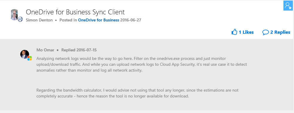
The recent conversations list is oddly designed. We get to see the title of the thread, and the latest reply in full. But not any other parts of the opening post. So unless the thread title is very well written (which rarely happens in any forum), there’s a good chance all we’re going to see is thread titles and a most recent post of “Thanks” or similar. The reply in the example below looks somewhat useful, but without the context of the opening post I don’t really know what problem is being solved here.
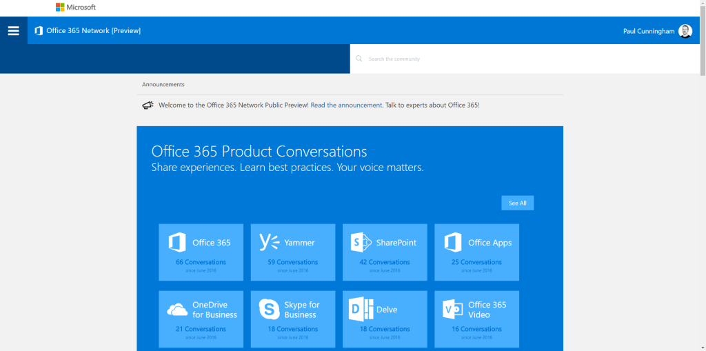
The homepage experience when you’re logged in does away with most of the “nothing” that is shown to a newly arrived visitor. But there’s still a lot of wasted space, and very few signs of life, without scrolling down (only to see the same limited view of “recent conversations”).
Entering one of the categories displays a series of “boards” (with more wasted space thanks to the large icons), which are possibly sub-categories? Who knows, since there’s no obvious hierarchical relationship. Also we now have an “Office 365” network with an “Office 365” category in which there is an “Office 365” board.
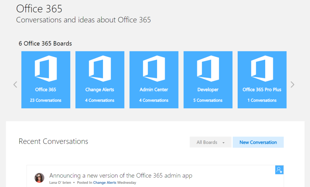
The board list can be scrolled sideways by clicking the arrows. When you do this, an animation moves every single board off to the left and a new list zooms in from the right. It’s very impressive until you realize they’ve all just moved one space across.
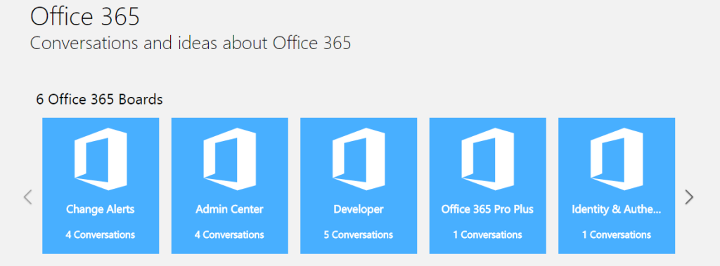
While we’re here, there’s an “Office 365 Pro Plus” board under “Office 365”, but there’s also a whole separate “Office Apps” category and boards. I guess one is for discussing deployment/administration type issues, and the other for discussing the applications themselves. It’s not immediately obvious, because every board has the same generic description once you drill down into it.
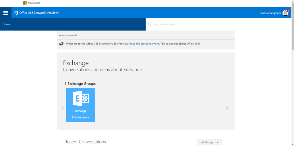
And honestly, what is the point of clicking on a topic called “Exchange” and seeing this…
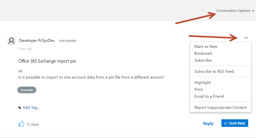
When you do get down to an actual conversation thread, the wasted space of the design continues to be evident. Strangely, with so much space to use, a lot of the UI elements are hidden under little menus. There’s definitely some work needed to surface more of these controls to users.
All in all, this is not the smooth community launch that one would hope for. A low friction user experience is key to any community launch, let alone one that has caused such an upset reaction from fans of the Yammer-based network. Nonetheless, this is where the community must move, because Microsoft is closing the Yammer-based network on September 1st. I’ll be doing my best to participate there, if I can ever fix whatever problem is stopping me from logging in via Chrome (without using an Incognito window).
Update 18th July – what does it say when Microsoft’s spam filters junk the email notifications from their own community forum…