
Last September at Ignite, Microsoft revealed plans to introduce two new portals in Microsoft 365, one focused on Security and one on Compliance. The motivation behind this is based on a few reasons, such as: modernizing the currently available portals, bringing functionalities from Office 365, EMS, Windows 10 and even Azure together, and to create better division between security and compliance-related tasks. A bit like if you were to split the functionality of the Security and Compliance Center (SCC) to more specialized, persona-driven portals.
In recent weeks the new Centers have been released for public preview, and in this article, I’ll take them for a quick spin and share some initial impressions. Please note that these are early preview versions meaning they are subject to change without any notice. From my experience, with every new portal we’ve seen previewed over the past few years, we shouldn’t expect to get a complete release, having parity with the SCC. Instead, expect to see a lot of missing features, and a gradual rollout over the course of the next few months. You can also expect the occasional bug here and there whilst in the preview mode.
The new Compliance Center
To access the new compliance portal, or the Compliance Center as it’s officially recognised, head to the Office 365 Admin Center, expand the Admin center’s group on the bottom of the left navigation pane and click Compliance. Alternatively, you can also use the direct link: https://compliance.microsoft.com.
Note: the preview is currently enabled only for tenants with Microsoft 365 subscriptions and might not be available to tenants with just Office 365 subscriptions.

The new portal has a fresh new design, which has adopted the same branding as the Microsoft 365 Admin center. The first thing that caught my eye in the new Compliance center was how compliance is in lowercase in the top left corner. Obviously, this is a very minor issue, but for whatever reason, my eyes were always drawn to it. Anyway, let’s focus on some more important features in the new portals.
The First-run Experience (FRE) section fills most of the initial screen and presents you with quick links to the documentation, suggested next steps and information on the various ways you can provide feedback. Below, you will find the two default “sections” of the portal: Assess and Protect. In the Assess section, you’ll see a quick glance of the current compliance configuration of the tenant. In its current form, it includes the Compliance score, as obtained from the Compliance manager, and a list of people with the most shared files.
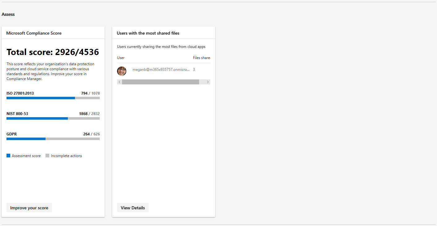
There are some design issues, such as the horizontal scrollbar and the cut off column label. However, the intention here is clear – to provide some important information and enable the Admin to perform relevant actions directly from the card, or from a pane popping out from the right. This hasn’t been recognized in the preview version of the portal, however, with every single card linking to external portals, most notably the Cloud App Security (CAS) and the SCC.
The Protect section is in better shape and features more cards, focused around DLP and integrated apps. Strangely, the Labels card is missing, which I find puzzling considering Labels is probably the most complete section of the new center, I’ll demonstrate this later in the article.
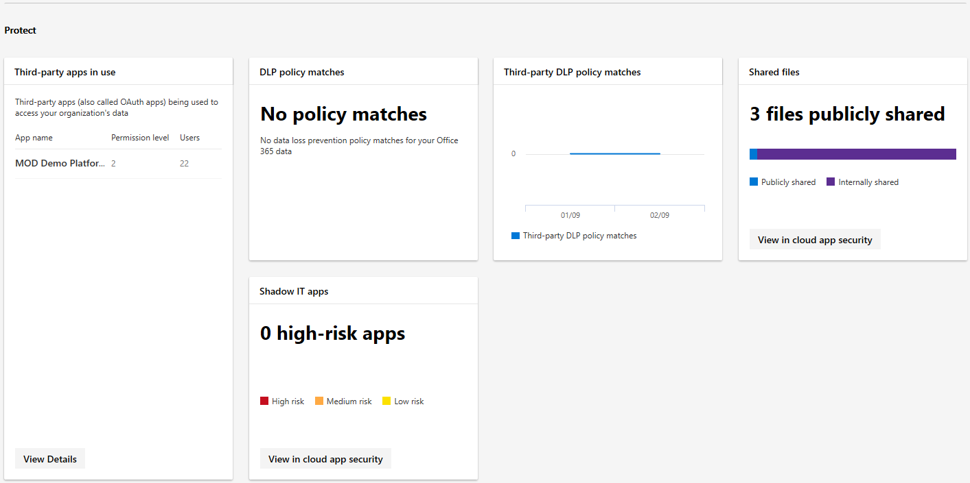
What’s currently missing as a step from the end-to-end workflow is the Respond section, where you can expect to find cards focused on alerts, eDiscovery, content disposition and more.
Now, let’s turn our attention to the navigation menu, where you will find some familiar entries from the SCC. The Home tab brings you to the initial dashboard, which we described above. Monitoring & reports feature the same set of cards you can find on the home page, but you can also get additional entries focusing on alerts, data insights and analytics in the future.
The Classification section features the familiar Labels, Label policies and Sensitivity Info types subsections from the SCC, and a new Label analytics one. As mentioned previously, this is the most complete section of the new Compliance center, and you can expect to see parity with the functionalities available in the SCC. Creating, publishing or deleting labels and label policies can all be performed here. My only remark is the the questionable choice of color palette used on all the pop-up panes.
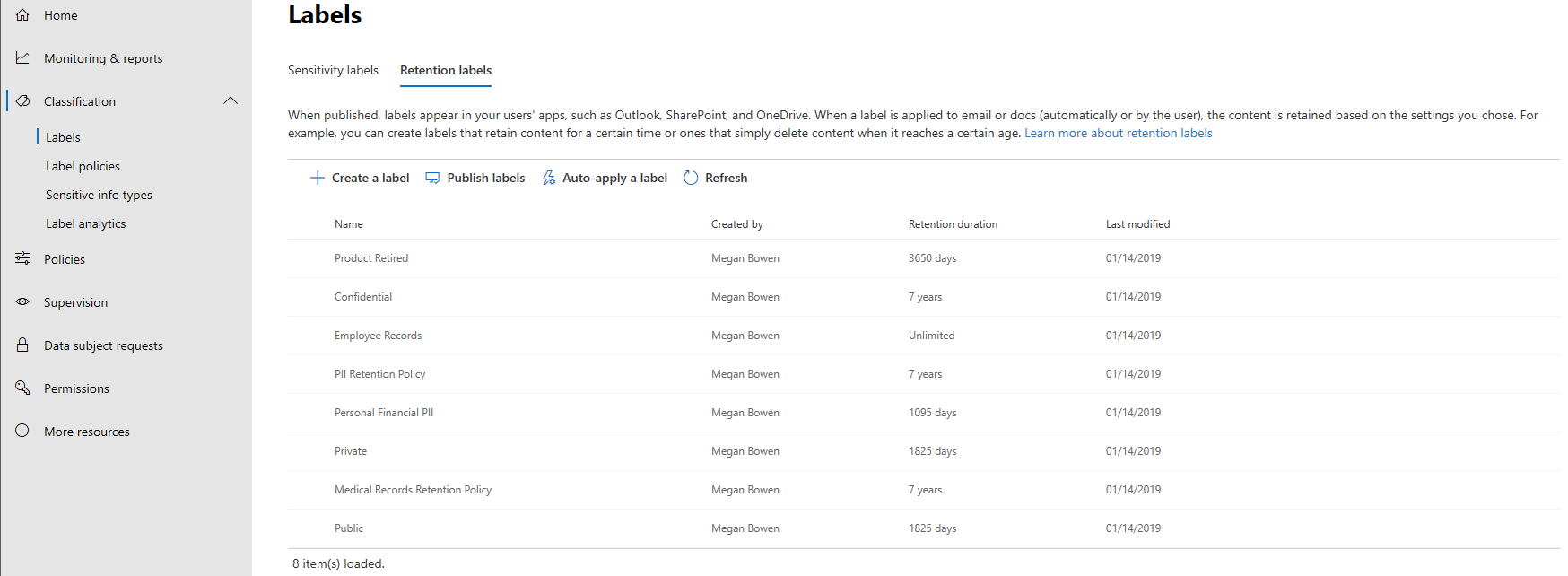
The Policies section on the other hand presents just a list of links to other portals, which annoyingly all open in the same tab. The Supervision tab currently lacks the controls to manage Supervision policies, so the actual setup needs to be performed from the SCC. We do however get a glimpse of the new integrated review experience, which can be accessed by selecting a given policy and clicking the Open button in the right pane.
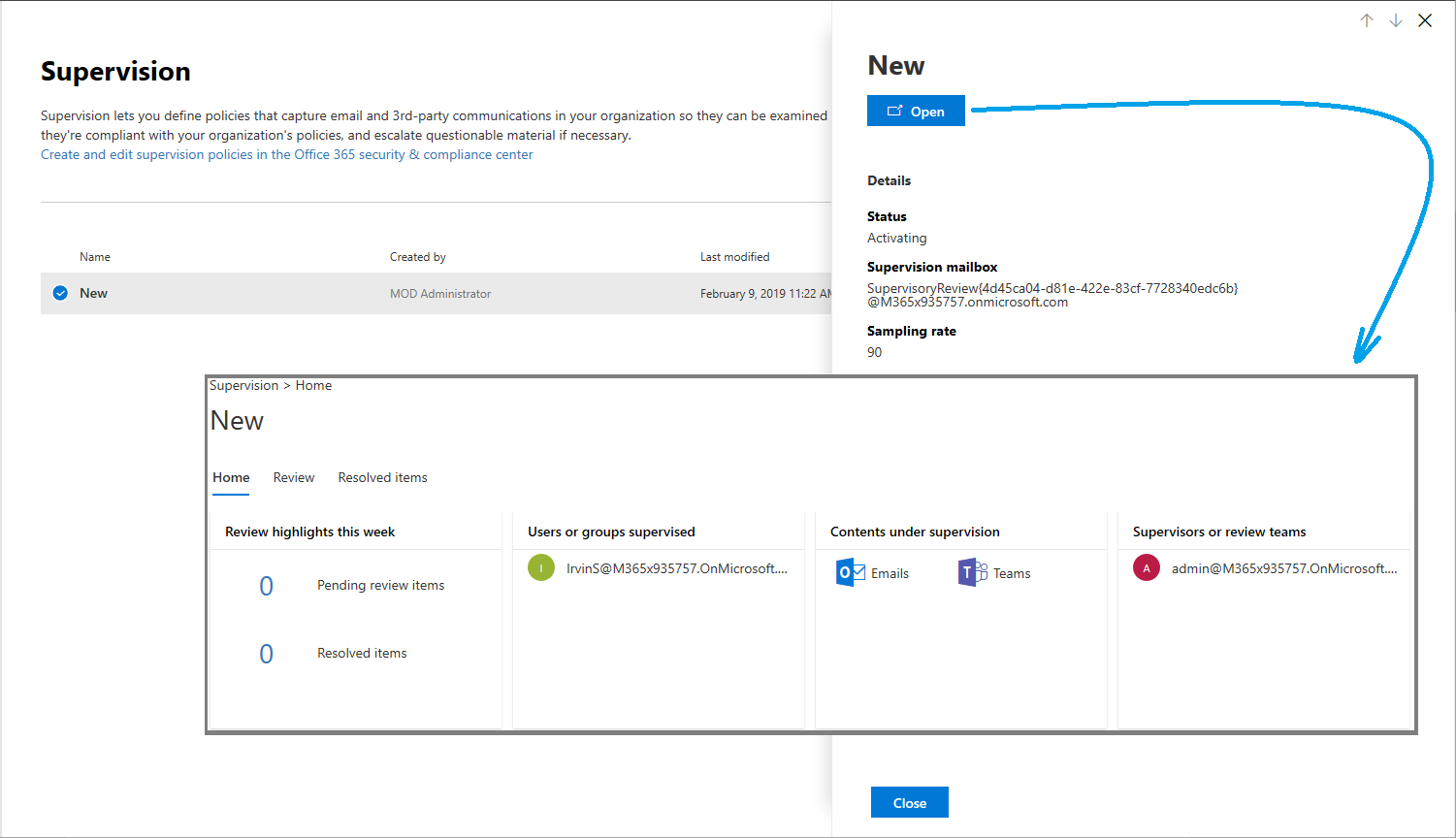
The controls to manage new Data Subject Requests are also missing from the corresponding tab, and you will have to continue manage those from the SCC. The only action you can perform in the new portal is to Open an existing DSR, which again takes you to the SCC, as all the eDiscovery and Content Search functionality is currently not available in the Compliance center. The last two tabs of the navigation menu expose the Permissions page, where you can check who gets access to the Compliance center, and the More resources page, featuring links to all the other important Security and Compliance focused portals.
Unlike the Microsoft 365 Admin center, we currently don’t have any ways to customize the Compliance center. This, however, is a limitation of the preview experience – Microsoft demoed the full version of the portal at Ignite, which featured robust customization controls. As the portal matures, you can expect to get all of these.
As a summary, the new Compliance center features a modern design, applied uniformly across all sections, unlike the current state of the Microsoft 365 Admin Center preview. There is some merit in providing a specialized, persona-based experience, however the number of times you get redirected outside of the Compliance center to other portals or pages is disappointing. That’s bound to change in the future, as the portal matures, and more functionalities are brought into the new experience. If you are interested in seeing what you can expect, check out this Ignite session recording.
The new Security Center
Switching gears to the new Security Center, which you can access via the Admin center’s link or directly at https://security.microsoft.com, you can expect more of the same. The design follows the same patterns as the Compliance center and is uniform across all pages and tabs. Customizability features are missing here as well, but as mentioned in the previous section they are part of the design and will be present in future iterations of the portal.
On the Home page, after skipping over the first run experience, you will be presented with Prevent and Detect sections. In the Prevent section, you will find cards that surface insights around identities, devices, applications, data and more. The Secure score card takes a central place, with five additional cards already available and more coming. On the other hand, the Detect section is almost barren, with the Alerts card (and page) not yet available.
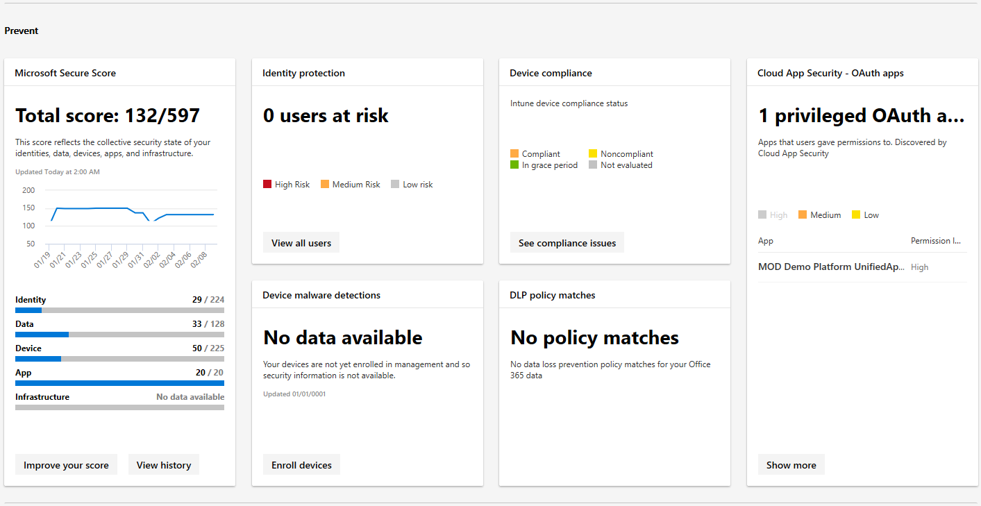
Moving to the next item on the Navigation menu, we have Monitoring & reports, where you can expect to find numerous reports organized in the categories we discussed above. Alternatively, you can group the corresponding cards/reports by topics, which include: Risk, Detection trends, Configuration and health, and Other.
The Secure Score tab takes you to an in-portal version of the Microsoft Secure Score, complete with an Overview dashboard, list of Improvement actions and History of the score changes in the past 90 days. The implementation of the Improvement actions section is a clear improvement over the corresponding section in the actual Secure score portal. Not only additional details such as the Rank or User impact are surfaced as columns which you can sort, group or filter by, but browsing between the items is made much easier thanks to the convenient Move up/Move down controls.
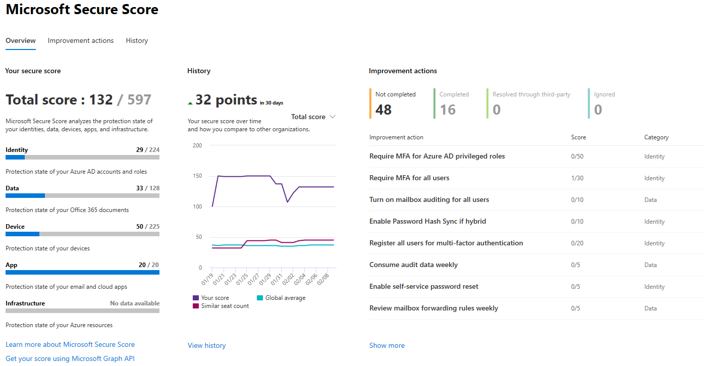
Unfortunately, in-page configurations here are not possible, and all actions will have to be performed from the corresponding portal, to which the View setting button takes you. Overall, this part of the portal offers just the type of experience you can expect to see from either the Security or the Compliance centers once they reach GA status, so make sure you give it a quick look.
Let’s look at the Hunting section, which is obviously named by the same people that “shoot” emails. This section is all about detecting suspicious activities and investigating threats across the whole suite of services bundled in Microsoft 365. Next, is the Classification tab, which is identical to the one in the Compliance center. This comes as no surprise, as labels and label policies span across both security and compliance, so at least some overlap is expected.
On the Policies tab, you can expect to find links to various Alert, Device or Threat protection policies. Permissions lists the roles that have access to the Security center and their corresponding members. Just like the Permissions section in the Compliance center, no modifications to the roles or members is possible, and you will have to use the Azure AD (or Office 365) portal for that. Lastly, we have the More resources page, with links to all the other admin portals.
So, what’s missing from the initial version of the Security Center? Most notably, the Alerts cards and section, and the Unified Audit log. Numerous other parts
Summary
In this article, we took a quick tour of the new, specialized, Security and Compliance portals (Centers) which were released just for public preview for Microsoft 365 customers. They featured a slick new UX and design that encapsulates the same branding as the Microsoft 365 Admin center, these portals are not only easy on the eye but also lightning fast. You can spot the occasional glitch or an element that the development team has overlooked, but the biggest complaint I can come up with is the short list of features currently available and the over-reliance on links to the other portals (many of which open in the same tab).
If you want to get a taste of what the new experience will be, I’d recommend trying the Classifications section (in either the Security or the Compliance center) or the Secure Score one. Other than that, the two new portals will likely be of little use in their current state, until features such as Content Search and eDiscovery, Alerts or the Audit log are integrated. If you want to glimpse even further into the future, check out some of the Ignite demos.


It’s been an year, and now Microsoft has finally started rolling these out to Office 365 customers.
How do i start learning M365 EMS ? Do we have any Learning path on Practical 365?
What are the features of EMS? Are EOP, ATP etc.. part of EMS solution?